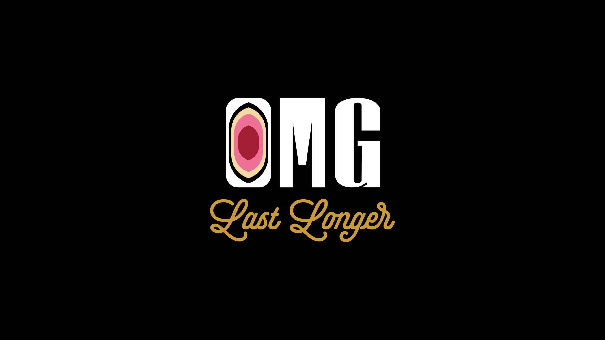
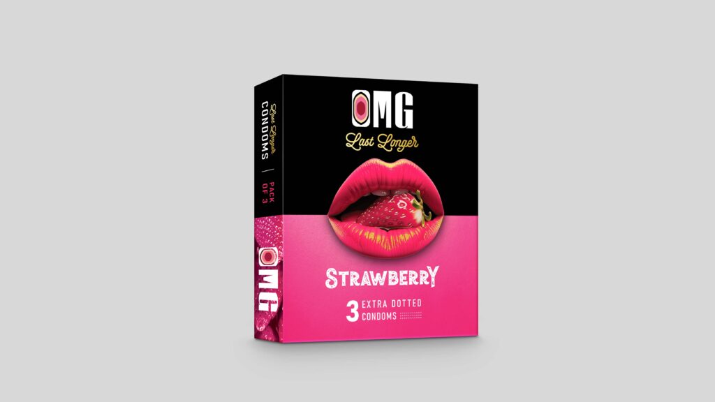
The OMG logo uses a bold, rounded typographic form where the ‘O’ doubles as a symbolic icon- subtly referencing intimacy while also resembling the tip of a condom, creating a smart dual meaning that ties directly to the product. The soft curves and minimal cuts make the mark feel modern, approachable, and slightly playful, aligning with a pleasure-focused brand rather than a clinical one.